GPT Image 2.5 Prompt Guide: Better AI Images and Edits
Learn how to write GPT Image 2.5 prompts with a reusable structure, Flare and Sunburst choices, exact text rules, editing steps, and practical examples.
 Image25 AI Team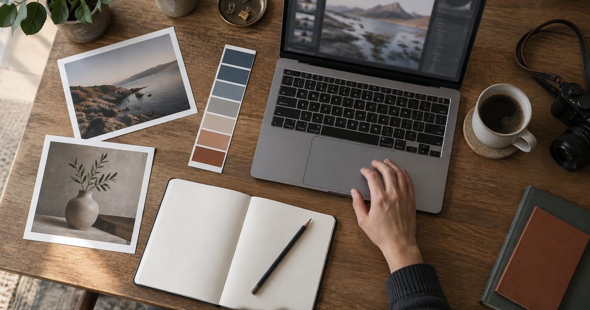
The most useful GPT Image 2.5 prompt is not the longest one. It is the one that makes the deliverable, subject, composition, visual direction, and constraints easy to check.
A reliable starting pattern is:
Create [deliverable] of [subject] in [setting]. Use [composition], [visual language], and [lighting]. Preserve [important details]. Avoid [failure modes].
Use that structure as a starting point, then refine one variable at a time. OpenAI’s current prompting guide also recommends separating API settings from the prompt, describing what should change and what must stay stable during edits, and comparing results on your own workload rather than assuming one setting is always best.
The photographs in this guide are AI-generated editorial scenarios illustrating briefing, product photography, and proofing. They are not customer photographs, product screenshots, or model-comparison evidence.
The seven parts of a strong GPT Image 2.5 prompt
1. Name the deliverable first
Start with the thing you need, not a mood word. “Create a product hero image,” “design a square app icon,” and “edit this room photo” give the model a concrete job.
Weak opening:
Make something premium and modern.
Better opening:
Create a 16:9 product hero image for a desktop AI image editor.
The second version gives you a format and a use case before you describe the look.
2. Describe the subject and its identity
State what must appear and which details identify it. For a person, include age range, clothing, pose, expression, and framing. For a product, include material, shape, color, label placement, and the camera angle. If you are editing a reference image, say which object is the source of truth.
Avoid piling on adjectives that do not change the output. “Beautiful, amazing, stunning, perfect” is less useful than observable details such as “matte black aluminum body, rounded corners, three-quarter view, soft shadow under the base.”
3. Add the setting and context
A subject without context leaves too many decisions open. Specify the environment, time of day, surface, background, and any objects that help the scene make sense.
For example:
Place the bottle on a pale stone bathroom counter beside a folded white towel. Use a quiet morning setting with a warm window light from the left.
Context is especially important when you want a believable product scene rather than an isolated object.
4. Control composition and camera language
Tell the model how the viewer should see the subject. Useful instructions include:
- close-up, medium shot, or wide shot;
- eye-level, overhead, or low-angle view;
- centered, rule-of-thirds, or asymmetric placement;
- negative space on a named side;
- portrait, landscape, or square framing;
- shallow or deep depth of field.
Use spatial language that can be checked. “Leave clean negative space on the right for a headline” is more actionable than “make it balanced.”

Define the subject, camera position, lighting, and intended crop before asking for a visual style.
5. Choose a visual language
Describe the material and visual treatment after the structure is clear. You can name a medium, lens impression, color palette, texture, or lighting approach:
Editorial product photography, natural neutral colors, soft directional light, realistic paper and fabric texture, restrained contrast.
Do not mix incompatible directions unless the contrast is deliberate. “Flat vector illustration with physically accurate film grain and macro lens bokeh” creates competing instructions. Pick the dominant treatment and add only the details that support it.
6. Write constraints as a short checklist
Constraints are useful when they protect something important. Examples:
- no watermark or logo;
- no extra people;
- keep the camera angle unchanged;
- preserve the product geometry;
- use one instance of the requested text;
- transparent background;
- do not redesign the character.
A constraint should explain what not to change, not simply repeat the desired style. For an edit, explicitly separate “change” from “keep.”
7. Define exact text separately
If the image contains words, put the text in its own labeled block and mark it as exact. Include capitalization, punctuation, placement, and how many times it should appear.
Text (EXACT, verbatim): "Fresh and clean"
Place it once, centered on the front label. Use bold black sans-serif lettering with clear spacing. Do not add any other words.
Always inspect the final image. A prompt can request legible text, but it cannot remove the need to check spelling, punctuation, and placement before publishing an asset.
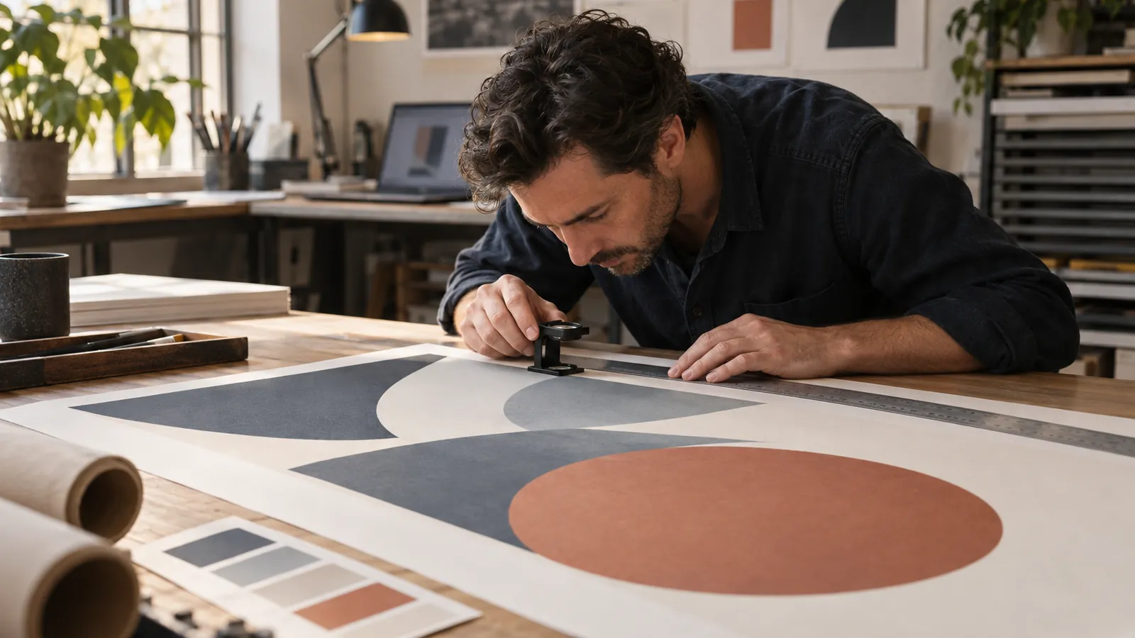
Check typography, edges, and composition at the real delivery size. A good thumbnail is not a final proof.
Flare or Sunburst: which model should you start with?
GPT Image 2.5 has two model choices. The official prompting guide positions Flare as the speed-focused option and Sunburst as the quality-focused option. That is a routing decision, not a promise that one model wins every prompt.
| Situation | Start with | Why |
|---|---|---|
| You need quick concept iterations | Flare | Test ideas quickly before spending time on polish. |
| The image contains delicate geometry or a demanding edit | Sunburst | Establish whether the higher-quality option meets the requirement. |
| You are migrating a working GPT Image 2 workflow | Flare first | Check whether acceptable quality is retained with a faster path. |
| Flare misses a detail that matters | Sunburst | Re-run the same prompt and inputs before changing the whole prompt. |
Keep the prompt, reference images, output dimensions, and quality setting stable when comparing models. Otherwise, you will not know which change caused the improvement.
You can also use the Flare vs Sunburst comparison for a task-by-task decision table.
Six copy-ready GPT Image 2.5 prompt patterns
Product hero
Create a 16:9 product hero image of a compact matte-black camera on a warm ivory desk.
The camera is the only product in the scene, shown at a three-quarter angle with the lens facing left.
Use soft morning window light, a muted cream and charcoal palette, realistic metal and glass texture,
and generous negative space on the right for website copy.
No watermark, no extra logos, no extra products, no readable text.
Poster with exact text
Create a vertical event poster for a small independent film screening.
Scene: a red theater curtain opening onto a single glowing cinema seat, atmospheric but uncluttered.
Color palette: deep red, warm gold, and black. High contrast and clear hierarchy.
Text (EXACT, verbatim): "NIGHT SCREENING"
Place the text once at the top in large uppercase letters. Do not add dates, names, logos, or other words.
Reference-guided edit
In the reference photo, replace only the white ceramic mug with a cobalt-blue glass mug.
Preserve the camera angle, hand position, table grain, window light, shadows, and every other object.
Make the new mug physically plausible with transparent glass, a blue tint, and a natural contact shadow.
Do not change the person or the background.
Consistent character
Create an original storybook character: a small fox with a rust-orange coat, cream muzzle,
round green satchel, and a navy rain cape. Friendly expression, short proportions, soft watercolor texture.
Show the fox standing in a misty forest clearing at dawn, full body, three-quarter view.
Keep the character design simple and repeatable. Original character only, no text, no watermark.
Diagram or explainer image
Create a clean editorial diagram showing a three-step image workflow from prompt to reference image to final edit.
Use three large panels connected left to right, consistent icon style, generous spacing, and a pale background.
Use abstract placeholder shapes instead of readable labels. Keep the visual hierarchy obvious and avoid decorative clutter.
Transparent product cutout
Create a realistic studio product cutout of a small brushed-steel desk lamp.
Show the complete object, including the base and cable, at a slight three-quarter angle.
Use neutral studio lighting and preserve accurate proportions.
Background: transparent. No floor, no cast shadow outside the object, no text, no watermark, no logo.
A better editing loop
Do not rewrite the entire prompt after every imperfect result. Use a narrow loop:
- Save the first output and the exact settings used.
- Identify one visible failure: wrong angle, missing object, bad text, or changed background.
- Add one instruction that addresses only that failure.
- Reuse the previous image as the next input when the task is an edit.
- Compare the new output with the baseline.
For example, if the product is correct but the background changed, do not add five new style paragraphs. Say: “Keep the existing product, camera angle, and lighting. Replace only the background with a plain warm-gray studio wall.” This makes the cause of the improvement easier to see.
Common prompting mistakes
Starting with adjectives instead of a job
A pile of style words does not tell the model what to deliver. Name the asset first, then describe the look.
Changing several variables at once
If you change the model, quality, size, reference images, and prompt together, you cannot learn from the result. Change one setting at a time.
Asking for “perfect” text without specifying it
Write the exact copy, where it belongs, and how many times it should appear. Then inspect it manually.
Giving contradictory constraints
“Minimal and packed with details” or “soft natural light with dramatic neon lighting” needs a priority. State which instruction wins.
Treating a reference image as a vague mood board
Say what the reference controls: identity, pose, product geometry, color, or composition. Also say what may change.
Final checklist
Before downloading an output, confirm:
- Does it show the requested deliverable and subject?
- Is the composition usable at the intended aspect ratio?
- Are the important identity or product details preserved?
- Is requested text spelled and placed correctly?
- Are there unwanted logos, watermarks, objects, or people?
- Is the output quality appropriate for the use case?
- Did you record the model, quality, size, prompt, and reference inputs?
Try the GPT Image 2.5 generator, browse the GPT Image 2.5 examples, and use the GPT Image 2 vs 2.5 guide when you need a version decision.
Sources and method
The model-selection and prompt-structure guidance above is based on the official OpenAI GPT Image 2.5 prompting guide, checked September 11, 2026. Product controls and credit estimates may change; use the values shown in the generator and pricing page for the current workflow.